Brand + packaging
Titanium Coffee
A minimalist brand identity for a micro-roastery: stamp-style logo, matte-black packaging, colour-coded label bands and pre-production 3D renders doubling as launch marketing.

Challenge
Titanium Coffee is a micro-roastery producing small batches of premium specialty coffee. The product was genuinely good. The branding was not. Generic packaging, no clear identity and nothing about the shelf presence communicated the care that went into the product.
Budget and production capacity were tight. No room for expensive custom packaging runs or elaborate tooling. Every design decision had to be practical as much as it was visual.
Approach
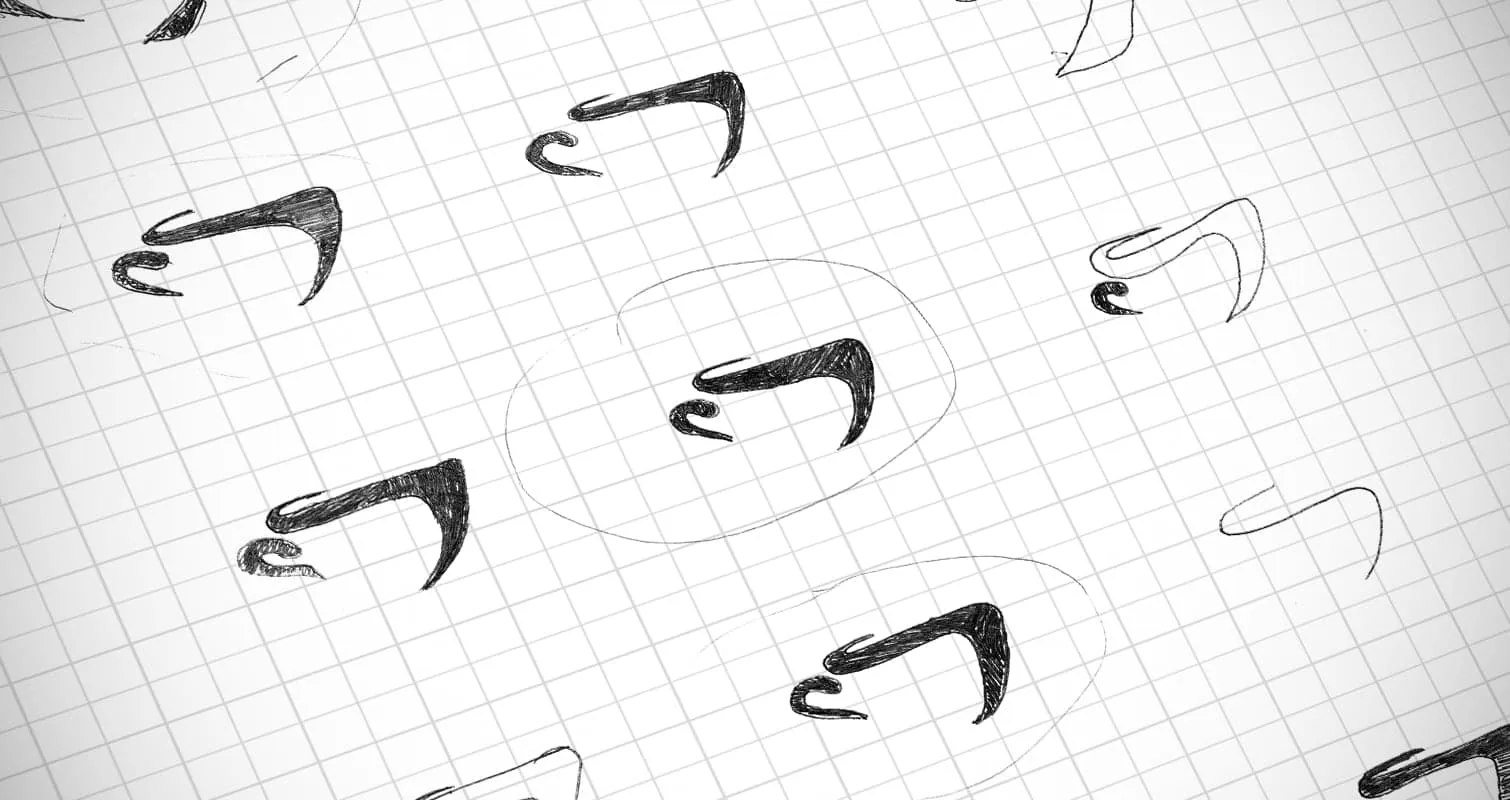
Logo
I drew from stamp and stencil aesthetics. Bold, clean, physical. A mark that works pressed into a wax seal, screen-printed onto a bag or reduced to a label on a retail shelf. That flexibility matters when you're working within small-batch production constraints.
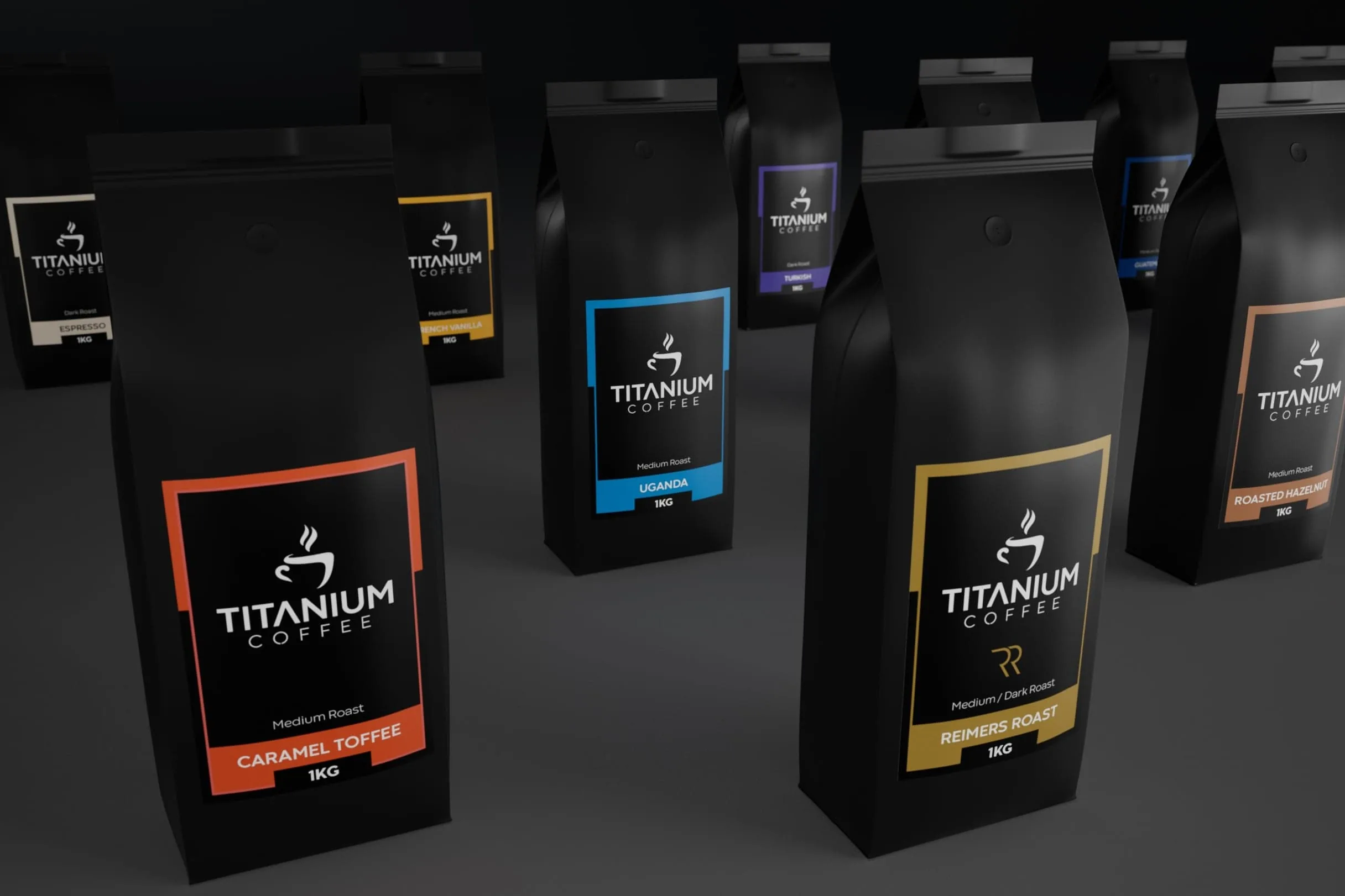
Packaging
Matte black base across the range. Reads premium without being fussy. Colour-coded label bands for each blend. Clean, scalable system.
3D mockups
Before any product photography was possible, I built detailed 3D mockups in Cinema 4D. Real visual assets for pre-launch marketing. Accurate shelf presence. A way to test label design on the actual bag form without going to print.
Result
Titanium Coffee now looks like the product it actually is. The brand identity gives it authority on the shelf and credibility with customers who take specialty coffee seriously.
The packaging system is built to grow. Adding a new blend means dropping in a new colour band and label, not redesigning from scratch. The 3D mockups did double duty as launch marketing assets, giving the brand strong visuals before a single photoshoot was booked.
Selected artwork


Talk first, quote second
Give your product the shelf presence it deserves.
I reply within 24 hours.