Premium packaging
Toni Glass Collection
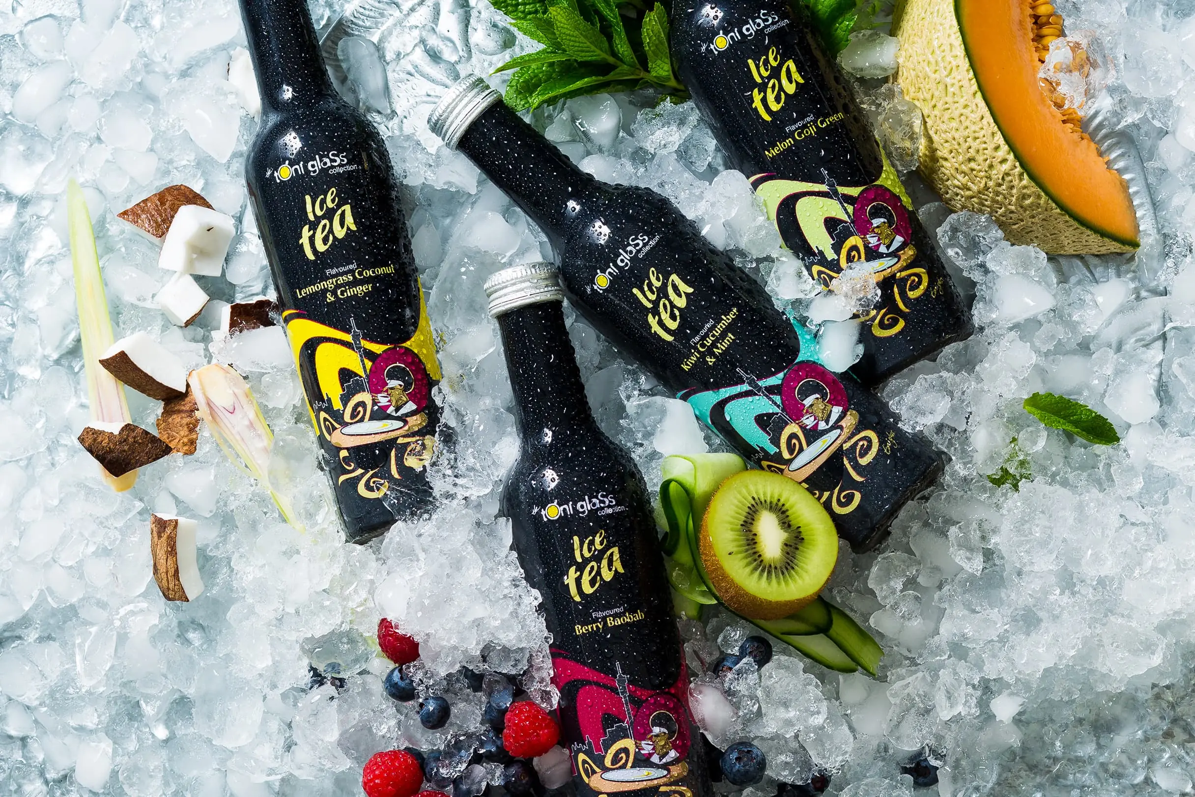
Minimalist labels for a premium iced tea brand. Designed to lean into the black glass bottle, separate flavours by accent colour and stand quietly apart in a shouty beverage aisle.
Challenge
Toni Glass had a genuinely good product. Premium iced tea in a distinctive black glass bottle. The problem: the label design wasn't carrying its weight.
South African retail shelves in the beverage aisle are aggressive. Saturated fruit photography, loud discount callouts, brands competing on volume. The original packaging read as mid-market. For a brand positioned at the top end, that gap between product and packaging was costing them at the point of purchase.
Approach
In a category where everyone is shouting, quiet confidence is the most disruptive thing you can do.
I developed a minimalist label that leaned into the black glass bottle rather than fighting it. Each flavour got its own accent colour drawn from the ingredient palette. Clean type, structured layout, negative space to let the label breathe. A subtle Johannesburg skyline motif and flavour-specific illustrated elements added local character without cluttering the design.
For the sugar-free range, I shifted to white bottles with the same label system. Clear visual distinction between the two lines while keeping the family look intact.
Result
The finished packaging gave Toni Glass a visual identity that matched the quality of the product inside. The black bottle range and white sugar-free range now read as a proper premium tier. The minimalist label holds up well in photography, in-store display and across digital channels.
For a boutique brand competing in a crowded beverage category, that shelf presence is what makes retail viable.
Selected artwork


Related services
Disciplines used on this project
Talk first, quote second
Stand out by getting the details right.
I reply within 24 hours.